www.silkfaw.com – Climate change visuals circulate every day, yet many of them lack context. A single dramatic chart might terrify viewers, comfort skeptics, or spark viral outrage, while quietly stripping away crucial details. When context disappears, even accurate data can deliver a distorted picture of planetary danger and human responsibility.
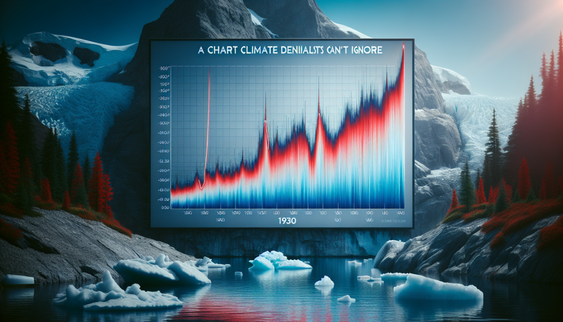
Recent debate over a chart highlighting relentless global heat since the 1930s illustrates this tension. The graphic feels persuasive because it compresses decades of warming into an eye‑catching slope. However, context about timescales, baselines, data sources, and human influence often vanishes from the conversation. To understand climate reality, we must restore that missing context and question how visual stories are framed.
Why Context Makes or Breaks Climate Charts
Climate charts appear objective. Lines rise or fall, colors shift from blue to red, and viewers assume the picture speaks for itself. Yet context determines what those lines actually mean. Choices about starting year, geographic coverage, and measurement units influence the message. A chart beginning in 1930, for example, may show a steady climb in temperatures, though it still hides centuries of prior variability.
Context also concerns what the chart leaves out. Global heat does not simply tick upward; it interacts with oceans, ice sheets, forests, and human systems. If a chart isolates surface temperature without noting ocean absorption or polar amplification, it only tells part of the story. People then misjudge risk, assuming the visual captures everything that matters.
There is another layer of context: political use. Advocates share frightening graphs to spur action, while opponents hunt for anomalies to dismiss concern. Each side may strip away nuance to strengthen its narrative. When context disappears, charts become weapons instead of tools for shared understanding. That shift erodes trust in science and deepens polarization.
How Misleading Context Feeds Climate Denial
Climate denial thrives on selective context. Skeptics love charts that start during an unusually hot year, then show a flat trend, implying warming stopped. Others highlight one cool season to claim the crisis ended. These visuals look convincing, because context has been carved away with surgical precision. The result is not science, but graphic rhetoric.
Even charts intended to debunk denial can misfire when context stays thin. A steep red curve since 1930 may rebut claims that warming is natural or minor, though it also invites pushback. Critics point to earlier warm decades or abrupt spikes, then argue the data set is cherry‑picked. Without clear context on methods and uncertainty, the chart becomes just another volley in an endless argument.
My own view is that scientists and communicators underestimate how powerfully context shapes perception. Many assume people will read captions or follow links to original studies. In reality, most see only the chart screenshot on social media. If context does not live inside the visual itself, it might as well not exist. Denial finds oxygen wherever that gap remains.
Reframing Climate Charts With Deeper Context
What would better context look like? First, climate charts should make choices explicit: show multiple baselines, include longer historical records when possible, and annotate major events such as volcanic eruptions or industrial surges. Second, designers should pair visuals with simple explanations of uncertainty, not as a hedge, but as honesty. Finally, charts need social context: links to lived impacts, from heat waves to crop losses, so viewers see that lines on a graph correspond to real communities. A chart might be technically correct yet incomplete. True climate communication demands visuals anchored in richer context, where accuracy, transparency, and human experience share the same canvas. Only then can charts guide collective decisions instead of merely provoking fear or fueling denial.